
Branding for Chinese Community
for The Vine Church Ltd.
There are three projects that I have worked on for the Chinese Community of The Vine Church. There are two projects which are closely related to each other and they share a very similar artistic direction. The first one is Tree of Life Course and the second one is Evangelistic Evenings. I had also worked on a Church-wide prayer night graphics for the community.
Tree of Life Course
The Brief
Tree of Life course will be focusing on the development of faith for any lay believer. It is a programme which aims to reach out to the general public. It also aims to spread the word of God in a contemporary and audience-friendly fashion. Tree of Life course is the extension of Evangelistic Evenings.
Challenge
There are 5 categories in the course, each focusing on a different topic. It is a big curriculum that covers many aspects of Christianity. It can be confusing if not grouped into separate sections.
The Solution
I had developed a system to distinguish different categories in the course with an overarching Tree of Life branding. I created a logo for the Tree of Life course and 5 sub-logo for the 5 categories. Each sub-logo with a significant element to represent its category. The logos can be placed on the visual of the specific course to identify the category the are in. I had also created headers for each of the logos for them to be applied on different occasion.
Tree of Life Logo
Based on a bible version Psalm 1:2-3, the Tree of Life logo is a depiction of a flourishing tree with 5 branches, each branch represents one category. The water droplet on the top gives life to the tree and nurtures the branches. I had picked a dark olive green for the tree branches because I wanted it to feel more mature, and a red orange for the water droplet and leaves to mimic the colour of dusk. The red orange water droplet is also an analogy of Jesus’ blood. A light beige background was used to add some warmth.
Moreover, I had created an alternate version of the logo.
Coloured Version (Portrait Orientation)
Dark Version (Portrait Orientation)
White Version (Portrait Orientation)
Coloured Version (Landscape Orientation)
Dark Version (Landscape Orientation)
White Version (Landscape Orientation)
Alternate version of the logo, it is a sprouting tree in a water droplet and it shares the same concept as the logo above.
Sub-logo of Tree of Life Course
I used the branches in the Tree of Life logo above and further developed 5 sub-logo. Using different elements of a tree, each element represents a category in the Tree of Life course.
I used a pastel-like colour system to make the logos distinguishable with each other while making the contrast between the colours less sharp to convey gentle and warm feeling.
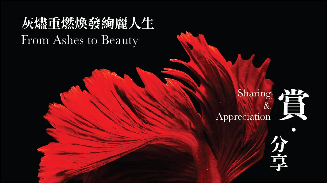
Fruits are grown from the tree to represent the abundance in christian living. A tangy orange colour of a citrus fruit was used.
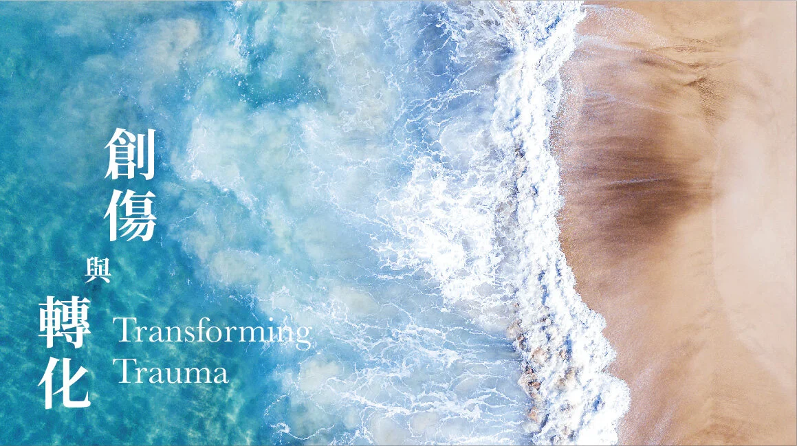
Leaves grow into flowers, it is a process which represents transformation. A refreshing blue was used.
The water droplet analogises the blood of Jesus. A red was used because of the blood.
A bird nest shows the process of nurturing. A botanic teal was used to represent the growth.
Butterflies are symbol of life and rejuvenation. A uplifting yellow was used.
Application of the logos
Having the contemporary direction in mind, I tried an image-heavy approach in the design. I used photos which carries a contemporary feeling. They are abstracts or close-up of ambient environment, and are open to interpretation.
The logos and titles of the courses are put on top of the images to show the categories they are in.
It is a close-up image of a butterfly wing. I used this vibrant image to show the transformation and uplifting feeling.
I picked a red leaves photo to represent the heart and the depth of field in the photo shows a kind of the transformation.
It is a water colour painting of a river. It illustrates the “river” in acts perfectly.
Evangelistic Evenings
Evangelistic Evenings is an event in which Chinese Christians gather. A photographic approach was deliberately chosen to depict a contemporary feeling. Photos are picked to illustrate the theme abstractly.


Church-wide Chinese Prayer Meeting
This is a prayer meeting for The Vine. Praying is a moment of tranquility, a peaceful space with just God and you. I chose a watercolour and minimalistic style to depict that moment with God.
Colour-wise, I picked tints of blue with less contrast to depict the calmness. Composition-wise, it is a droplet of water into a river which is an analogy of the Christian Community.
Website Banner
Social Media